From Ideation to Launch: The Unveiling of Qpidcon - A Journey through User-Centric Product Development
Embarking on the journey to conceptualize, build, and launch Qpidcon from scratch involved a meticulous process spanning various stages of product development. Allow me to share the comprehensive steps we navigated through during the user research and discovery phase, which ultimately led to the successful introduction of Qpidcon to the market.
Identifying the Problem
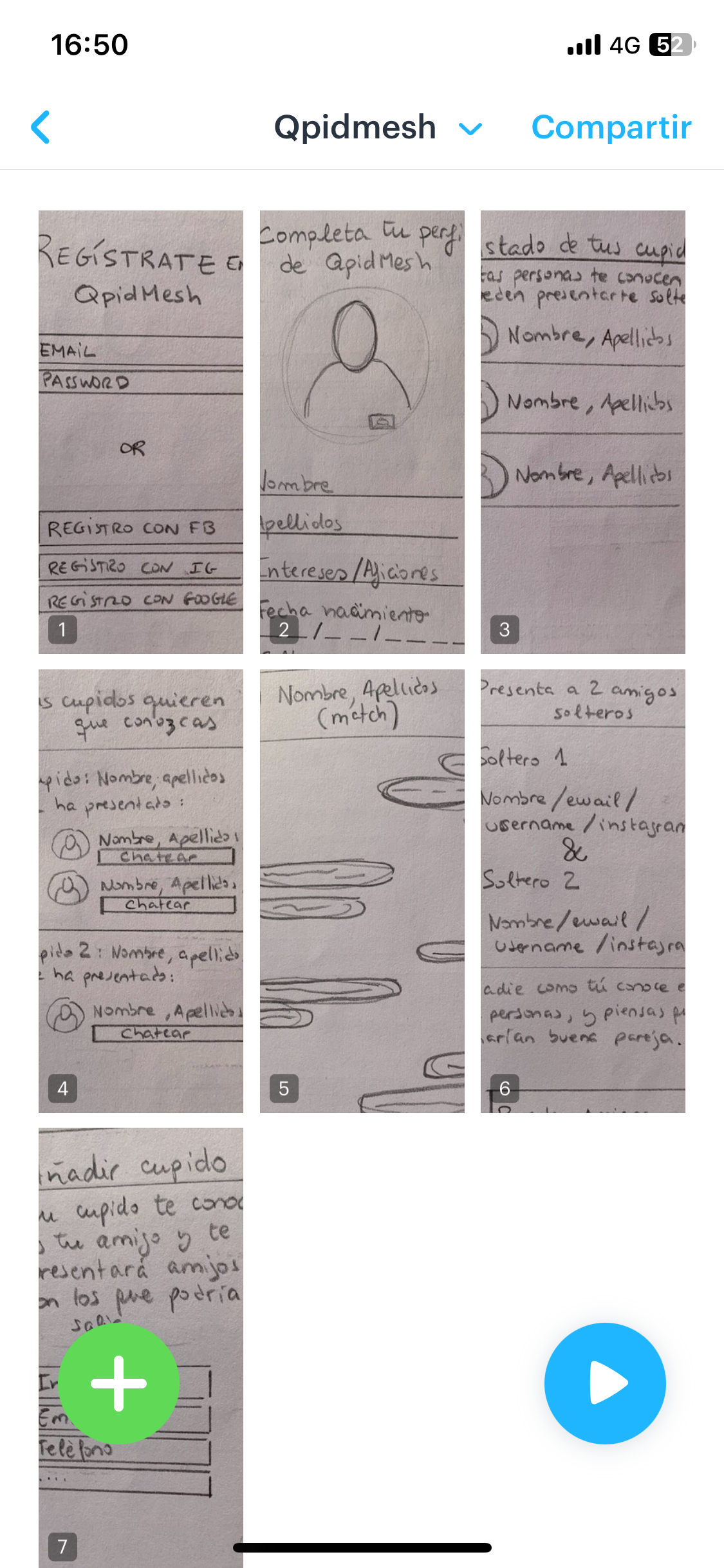
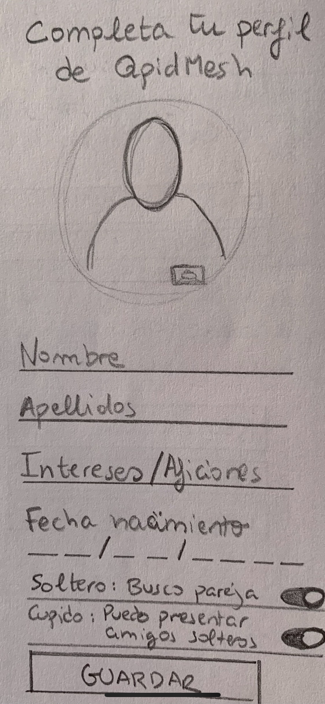
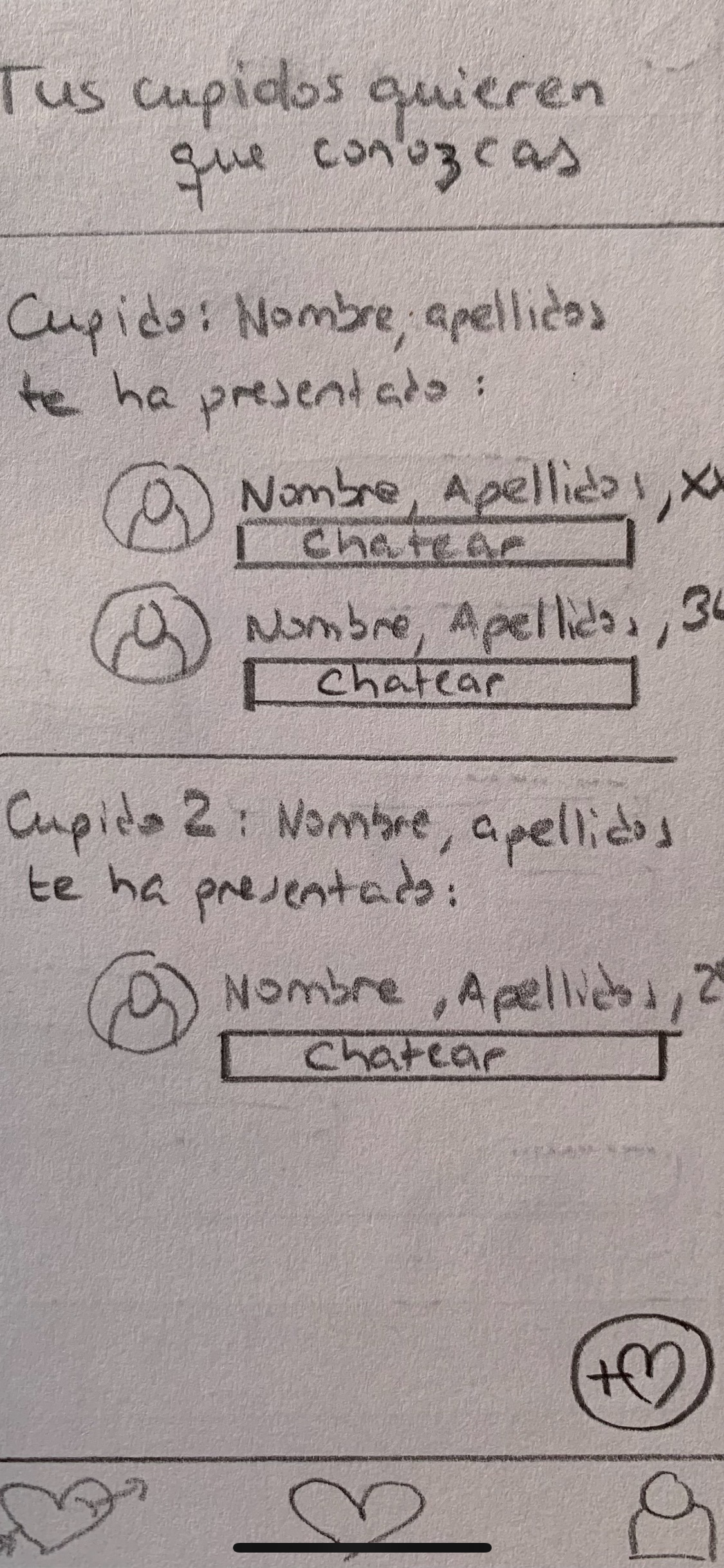
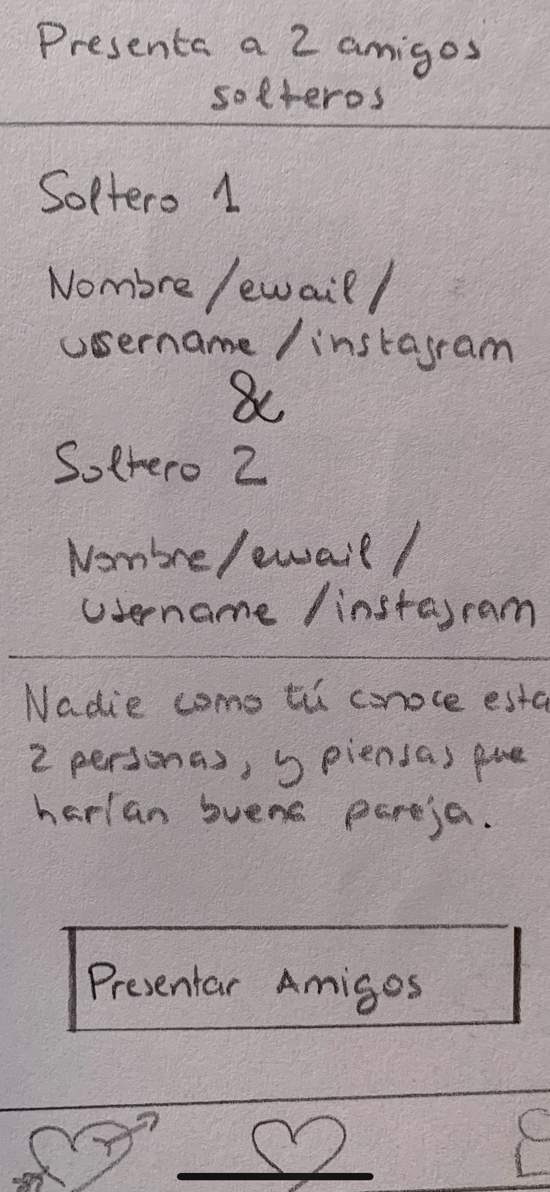
The initial step involved a thorough exploration of the problem at hand. Drawing from personal experiences, digging into existing solutions and their shortcomings, and understanding the contemporary context, I honed in on a genuine issue. Engaging in discussions with potential customers and peers ensured the validation of the problem. At this juncture, envisioning a scalable online platform seemed apt, aligning with societal trends. The conceptualization began with pencil sketches, giving shape to the envisioned platform's various screens. A discovery during this phase introduced Marvel, a platform enabling the simulation of navigable drawings, providing an early glimpse into the potential user experience.
First Designs and User Feedback
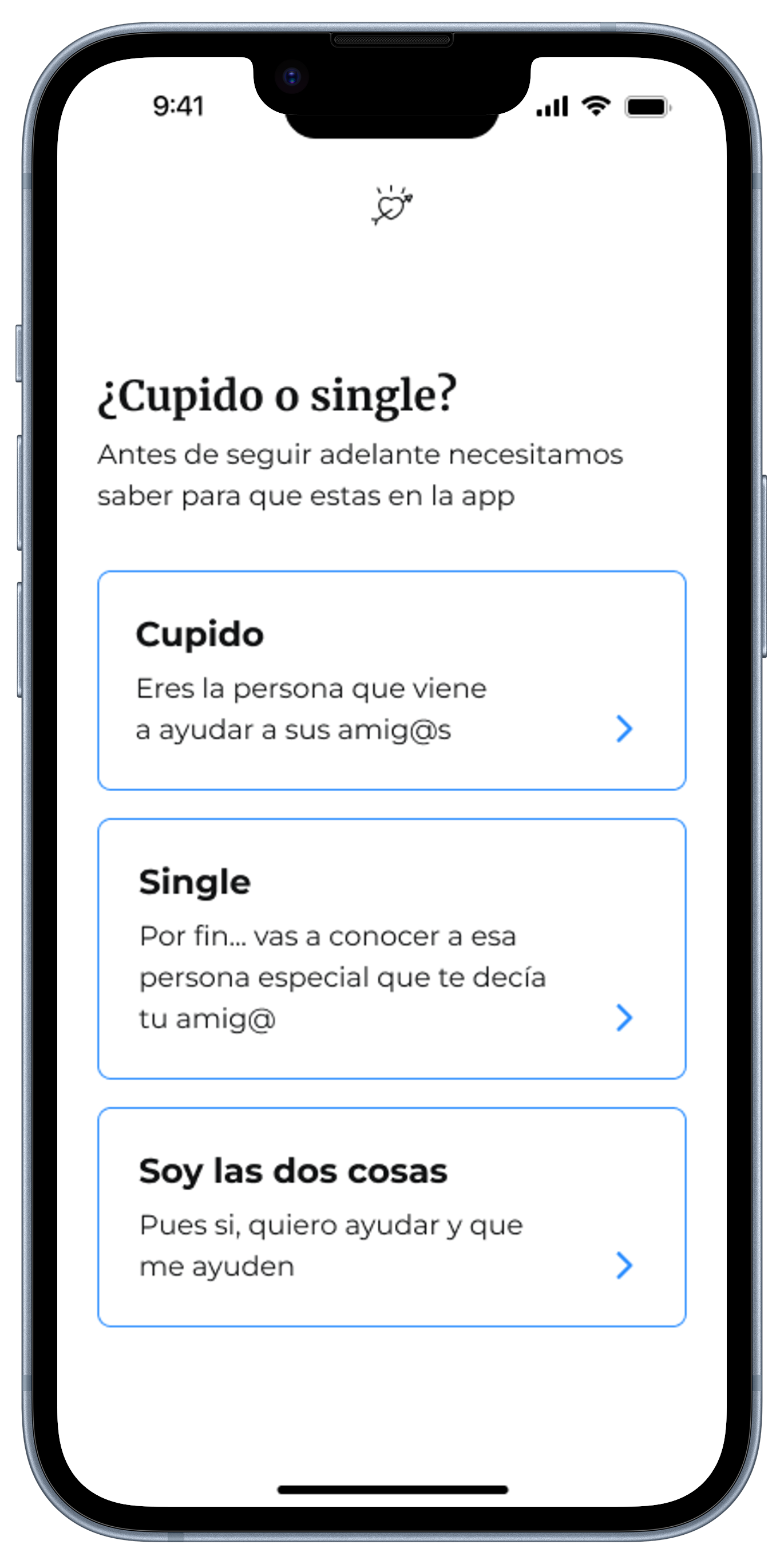
To initiate customer interactions, a preliminary design was crafted using Uizard—a tool tailored for non-designers. Seeking feedback on specific features and gauging users' sentiments towards a platform aimed at solving a significant problem was the focal point. Ten users, selected strategically from friends, family, and acquaintances, formed the initial user base. While this phase provided valuable insights, recognizing the need for a more polished design, I enlisted the expertise of Silvia—a highly skilled designer with whom I had previously collaborated. Her design, generated with Figma, elevated the prototype, setting the stage for a more professional exploration of users' needs and preferences.
First Mockups and Prototype Including Main Features
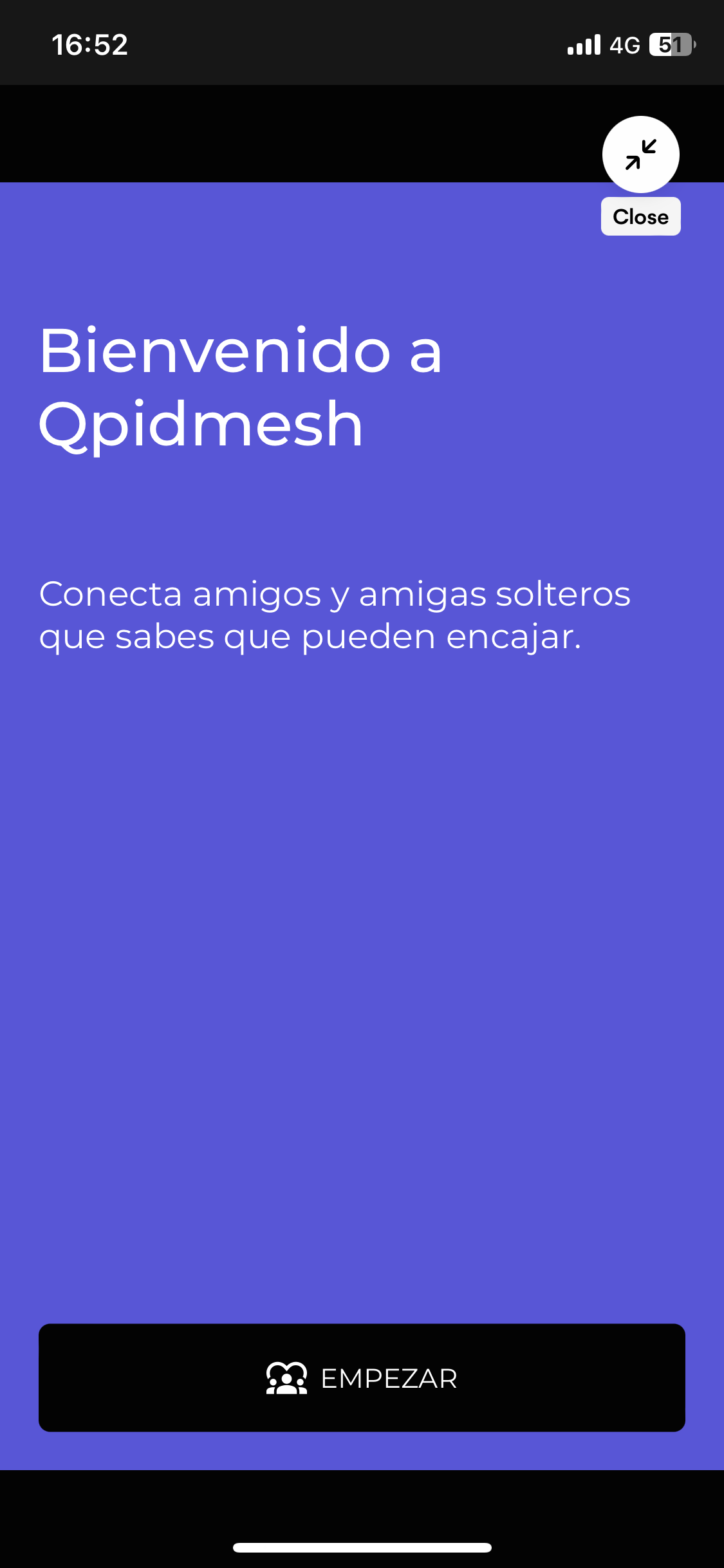
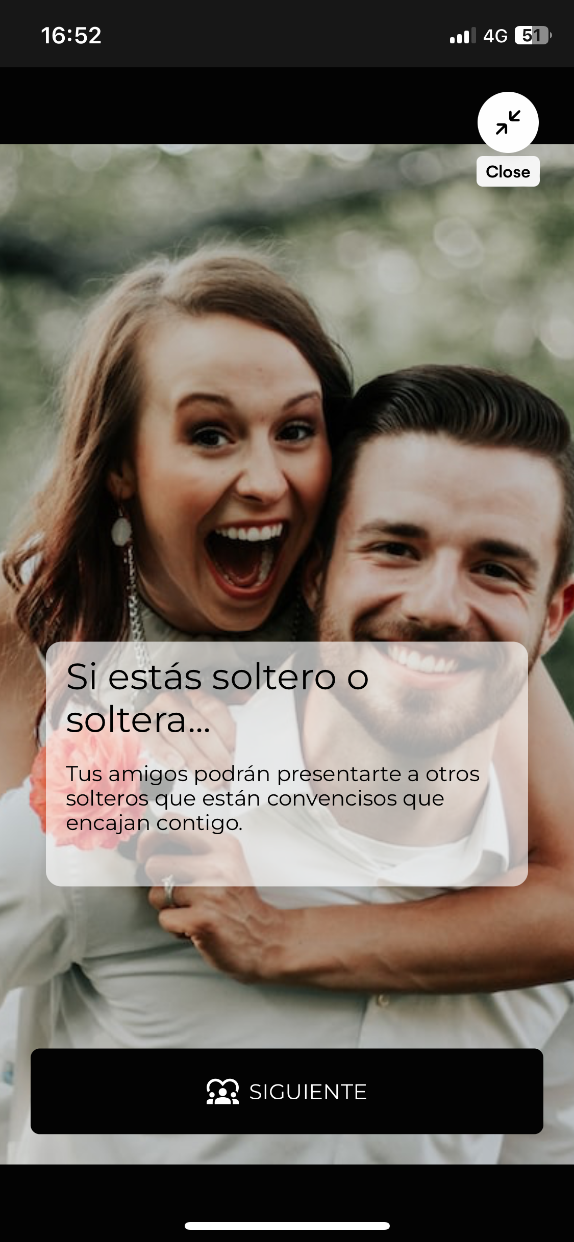
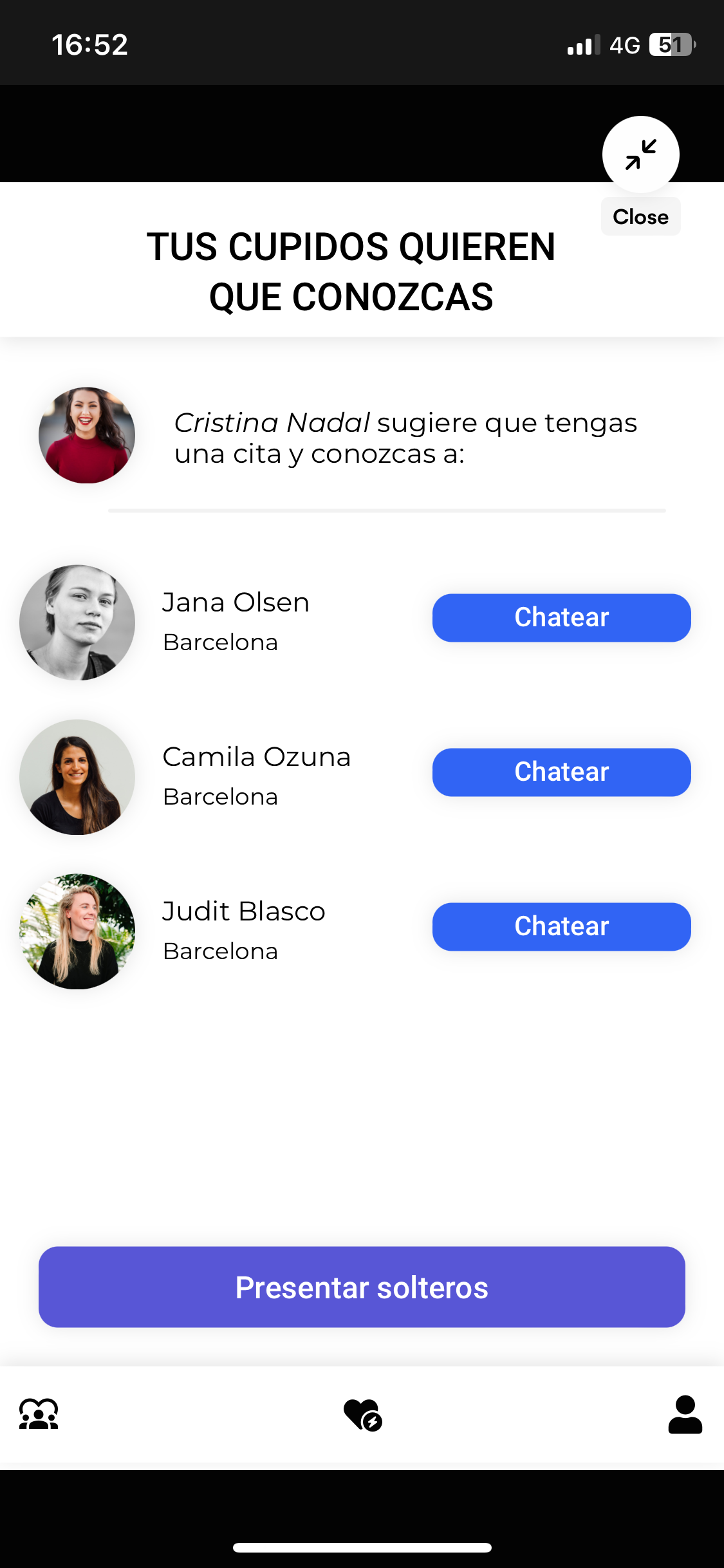
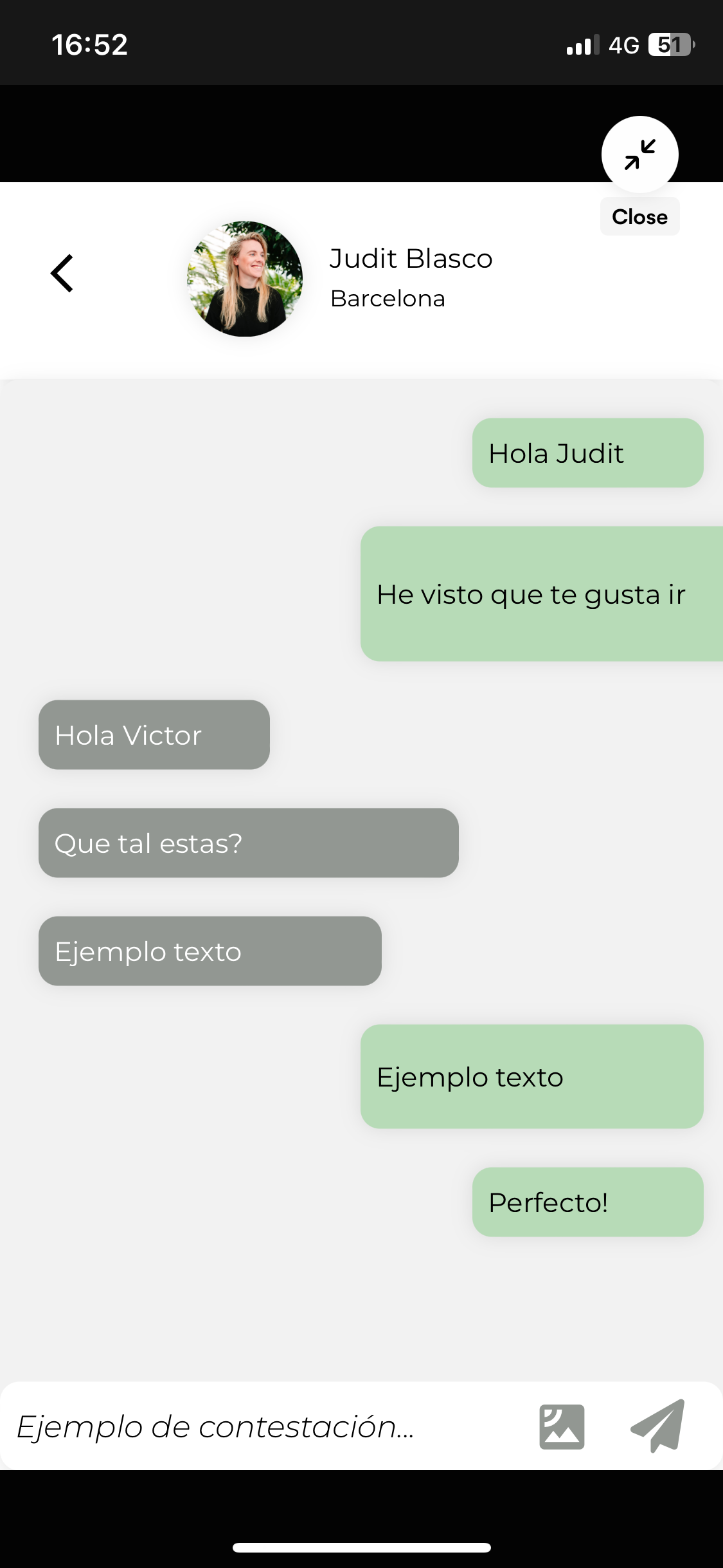
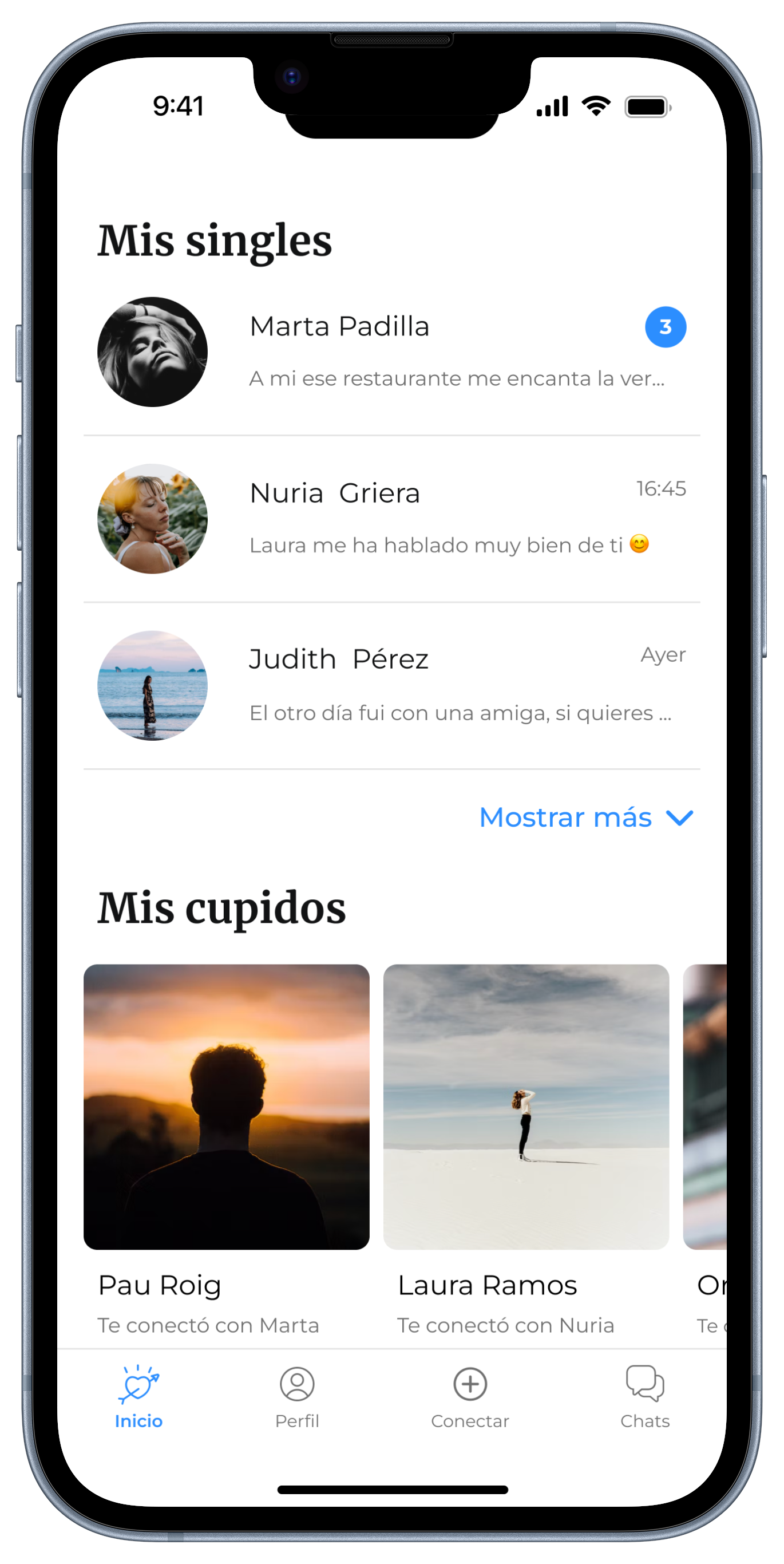
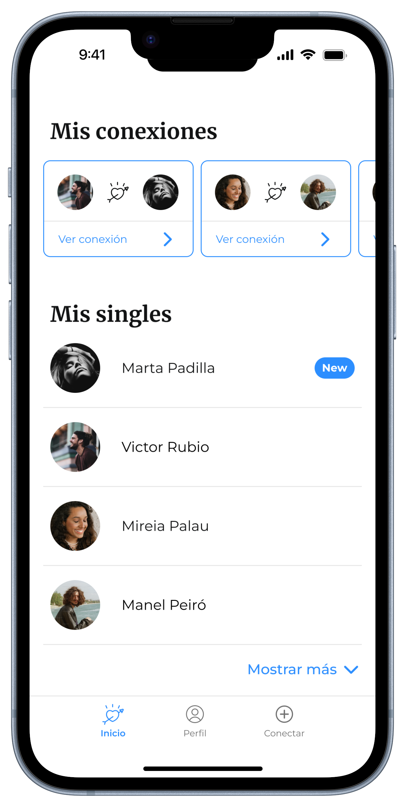
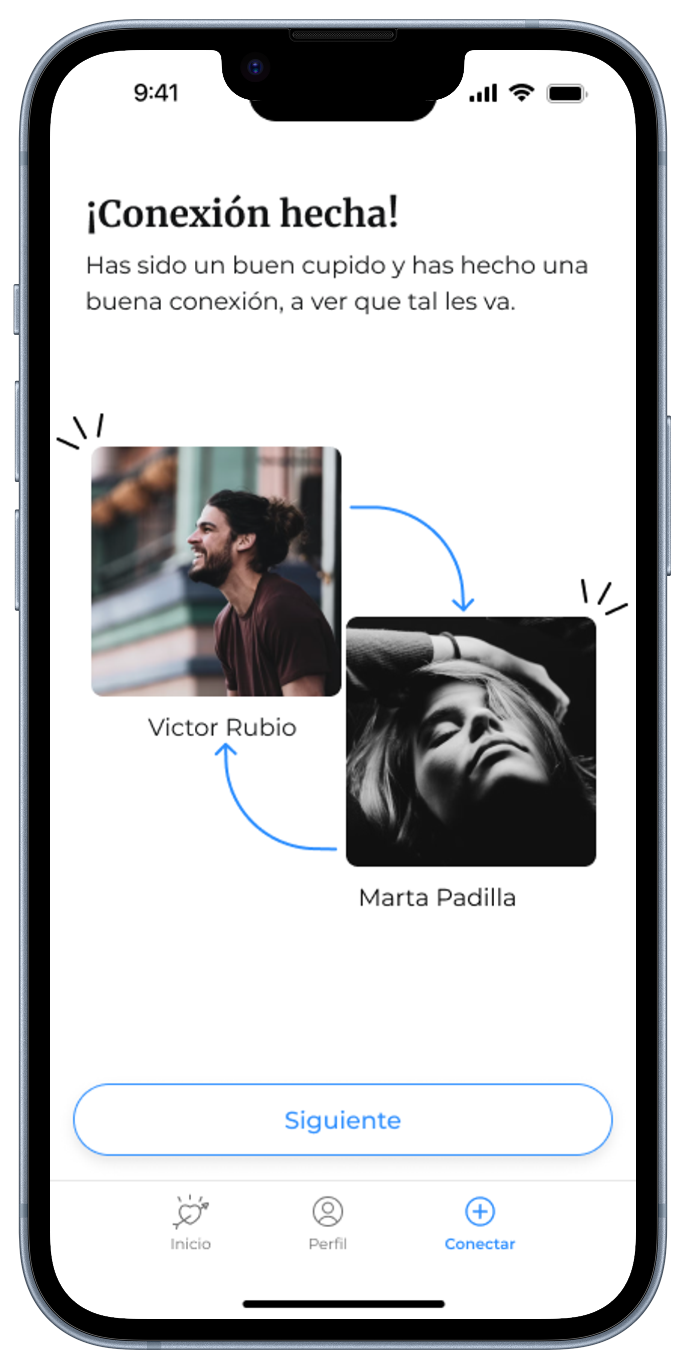
Silvia's Figma-designed solution became the centerpiece of the second round of user interactions. Seeking opinions on branding elements like colors, fonts, and images, users were also presented with an initial prototype encompassing the signup process and main screen functionalities. Incorporating feedback gathered during this stage, we refined the solution to craft the Minimum Lovable Product (MLP).
Rolling Out the First Version
With the MLP in hand, a third round of user engagement ensued, allowing users to interact with the solution while providing comprehensive feedback. Questions probing overall experience, comprehension of functionality, and suggestions for improvement were posed. Tweaks were made based on this feedback, leading to the rollout of the first version. Specifically shared with a targeted user group in Barcelona, Spain, this marked the commencement of data collection and further feedback gathering.
In summary, the journey from ideation to the introduction of Qpidcon involved a meticulous progression through defining the problem, gathering user feedback, refining designs, and culminating in the successful launch of the first version—a testament to the iterative and user-centric approach adopted throughout the product development process.
